Stop Freaking Out About Facebook Page Updates
Facebook announced a design update to their Pages product. While most page admins will not see these changes for at least a few days, you can join the waitlist, via an invitation that can be found on each page’s timeline view. All Facebook pages will be automatically migrated to the updated design, on March 27th, 2014.

I don’t understand the barrage of objections and complaints every time Facebook updates their Pages platform. It is almost as if these people believe they own their Facebook page, which they obviously do not. This also reiterates the need to have a home base outside of your social platforms. Don’t do all of your work on Facebook or any other platform that you do not control. Use your social profiles to compliment what you’re doing on your own properties. I admit, sometimes Facebook messes with things that weren’t broken and it can be frustrating, but they’ve also added an incredible amount of value for marketers. Imagine marketing a small business 10 years ago, paying $1000 for a 300×300 display ad to run for one day in a local newspaper. How about the days of the Yellow pages, where you may have paid tens of thousands of dollars for a listing? The ability to create a following on Facebook, or any other social platform, is tremendous. Don’t lose perspective, simply because it’s not as easy as it was 5 years ago. Suck it up and put some work in.
But Facebook Just Wants Money
The chief complaint today is that Facebook is looking to increase advertising revenue. Do me a favor. Please name a successful business, whose objective isn’t to generate profits. Yeah, you can’t. Consider the Facebook landscape 5 years ago as a massive beta testing period, or a 5 year introductory trial. You could do whatever you wanted, most businesses still failed at it, and simply posting garbage would get your company some free exposure. Today, you can’t get away with that…for free. While creating an authentic, organic following is still possible, it has gotten significantly more difficult. A local or small business will increase its growth exponentially with a mere $5/day promotional budget. That’s $150/month to reach laser targeted customers, clients, or potential ones. If your advertising budget cannot withstand $150/month, then you need to take a hard look at what your business is, because if $150 hurts, your business is already doomed…and not because you’re losing organic reach on Facebook.
Oh no, the Sky is Falling
For several years, Facebook has updated the design of their pages to be similar to their personal profiles. Why does it shock so many people that Pages designs were updated more than a year after the personal profile updates? The positives of this change outweigh the negatives, so embrace it. 99% of the complaints are also coming from people who do not even have the update yet. Relax, take a deep breath, and I’ll walk you through the changes on one of my pages…
Cover & Profile Image
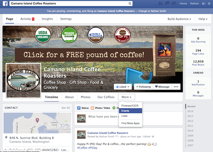
While the dimensions of the Facebook Cover Image and profile images remain the same, 851×315 and 180×180 respectively, the positioning has changed. Another change to the cover image area is the placement of the page name, as well as the categories. These are overlayed onto the cover image, in white text. If you currently have images or text in this area, or your cover image background is white, you’ll need to update those ASAP.
Goodbye Admin Panel
As you can see, the ‘Admin Panel’ has been replace by a tabbed menu at the top. There is also a quick insights bar on the right side. The “Activity” tab will show notifications, which you may click to navigate to the activity log, but if you just want to make it go away, click the “Notification” link on the right side of the page. (This will display your recent activities, but not take you away from the page) This image also shows ONE of the locations of your custom tabs. You can see the “Our Coffees” tab is a prominent text link, while additional tabs are in the “More” menu.
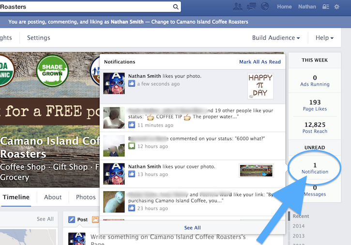 Click “Notification” to stay on the page when reviewing activity.
Custom Apps & Thumbnails Still Visible
As noted before, this has been a major sore spot for most folks complaining about the update. As you can see in the image below, however, the custom apps and their associated custom thumbnails are still visible on the page. No need to jump off of a bridge. Aside from possibly the first interaction with your page, Facebook users rarely return to your page. The benefit of the custom apps is the ability to drive traffic to them, in order to capture leads, sell product, etc.
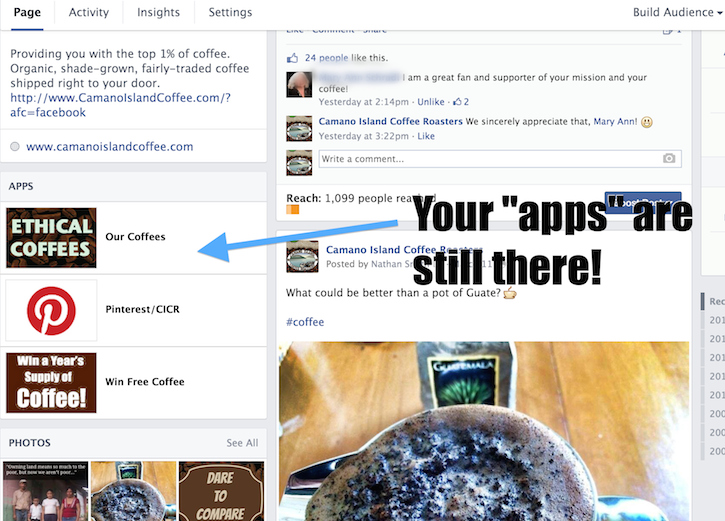
Similar to personal profiles, the page’s photos, videos, and additional information are featured further down in the left side of the page. All of the page’s posts are in a single column on the right side of the page. This makes it easier for people who happen to actually visit your page, initial contact and about 2% of your established connections. Below the page’s images and videos is where you will see the posts from others, which were formerly listed at the top right side of the page. Even further down the left side of the page, users will see suggestions to find new pages, in the same category as the current page, that their friends are connected to. A minor negative is the removal of the “reviews” section. The star rating remains for company pages, but reviews are lost. Some have reported that this is not the case for pages that are categorized as “Local Business”. The benefit of losing the reviews section is that people will post in a single area, which reduces clutter and irrelevant ‘reviews’. One addition to the star ratings, is the indication of how many ratings were received for each option of 1-5 stars.
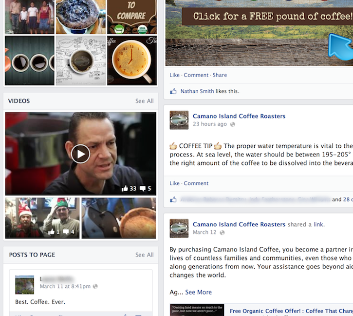
UPDATE: As of March 26th, the “Reviews” section has been restored! If your business page had a reviews section in the previous design, it will continue to have one in the updated design. 🙂
Floating Call To Action LIKE Button
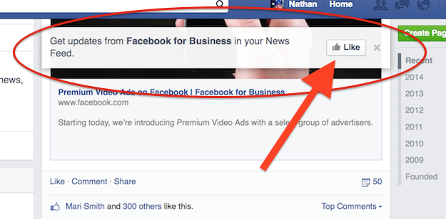
If a visitor happens to find themselves on your page, and they do not already like your page, they will be prompted with a new, call to action LIKE button (as in the image below). This is a new feature, which gives the main view of the page some added pop with conversions. As the visitor scrolls down, the call to action follows them.
Other than the largely cosmetic changes we covered in this post, very little has actually changed. Facebook will continue to evolve, as our job of marketing our businesses will as well. The trick is to stay current and fully leverage the tools available to you. If you have any questions, I’d be happy to help you. Simply leave them in the comments section below.
